Charger Challenge
Albuquerque Academy Fundraiser CampaignChallenges
Charger Challenge was a 2022 fundraiser campaign at Albuquerque Academy. My task was to create a campaign with distinct and recognizable branding that still followed the organizational branding guidelines. The organization is undergoing global rebranding, moving to a more accessible, friendly, and minimalist design.
The target audience for the Charger Challenge fundraiser was alums and community members who have established careers or are retirees. Therefore, I focused on traditional designs with an especially heavy emphasis on minimalism and legibility. In the past, formal designs have been important to this particular group.
Additionally, as Advancement was the responsible department, I was charged with honoring their vision for the campaign while also offering effective design.
Outcomes
I produced a style guide for current and future reference, with branding robust enough to be used for future fundraising campaigns as necessary and desired. The graphics for various channels helped build campaign awareness and generate community interest.
Campaign Logo
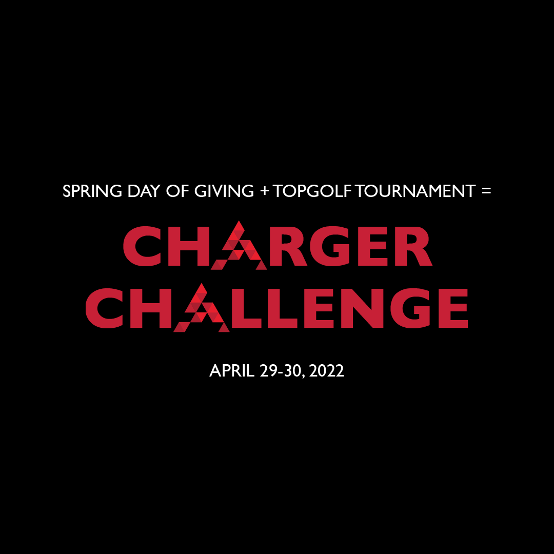
Advancement’s vision for the campaign logo was to use the campaign title, Charger Challenge, and emphasize the a’s to reference Albuquerque Academy. In the past, they often did this by adding two a’s instead of one, ie, “ChAArger ChAAllenge.” This had a few challenges. For one, some potential donors mistook it as a typo. Additionally, there was a possible association with unrelated organizations that use the acronym “AA.”

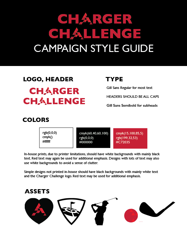
I addressed this by replacing the a’s in Charger Challenge with the Academy logomark. This honored Advancement’s vision of emphasizing the a’s, as well as following the overall Academy branding and emphasizing the campaign’s connection to Academy. Academy colors could be retained, and overall clarity was improved.
Poster Series
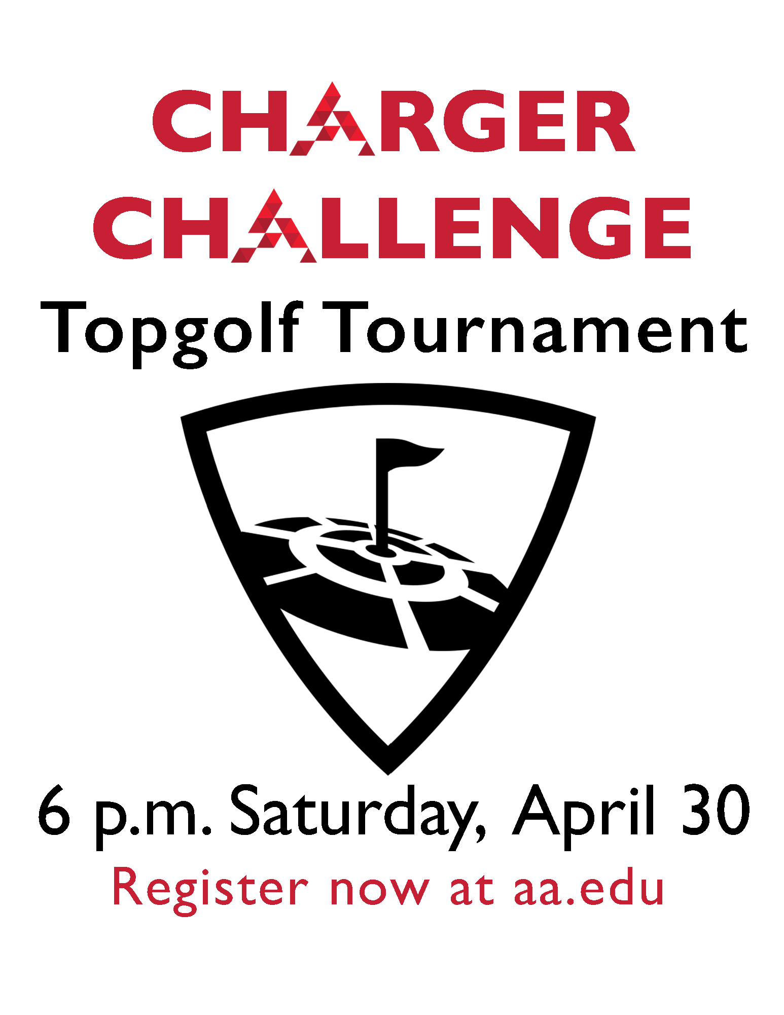
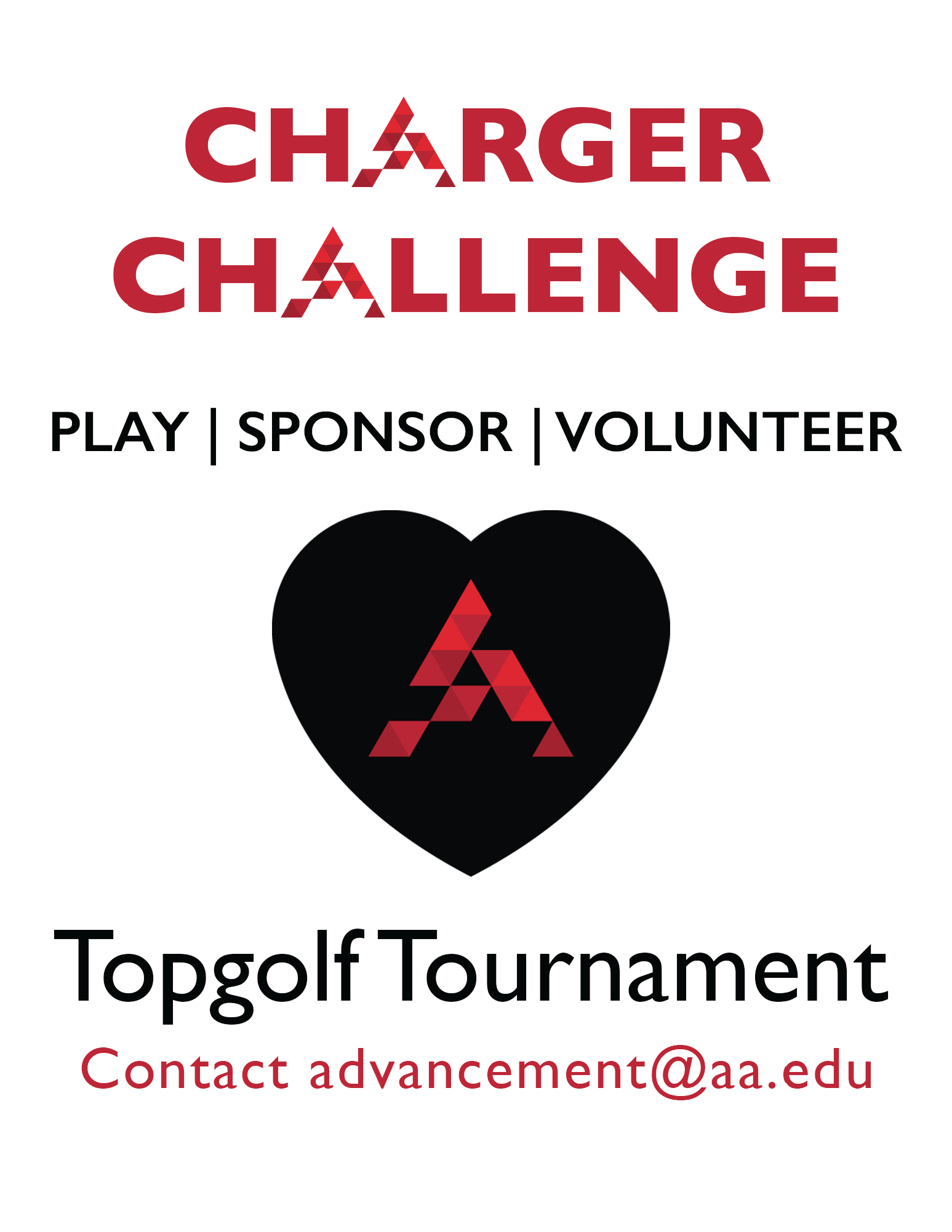
Advancement’s original concept for a poster design had a significant amount of information, so we ultimately decided to differentiate into a three-poster series. Each poster had a different emphasis, and I designed a key image for each one to visually represent the purpose and content. The posters were primarily focused on generating awareness about the different ways to get involved in the Topgolf Tournament, with an emphasis on the date of the tournament.

Digital Images & Email Campaign
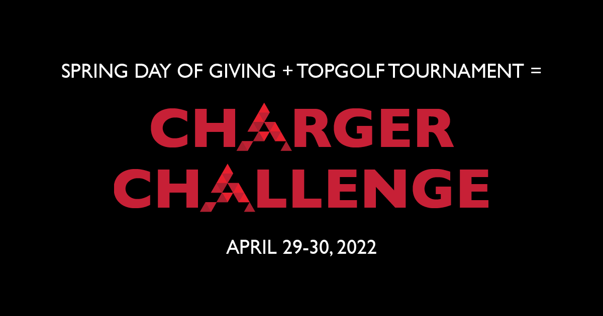
For the campaign, Advancement needed email and social media banners. The emails were the primary method of communicating details and CTAs: ticket purchases, donations, and sponsorships. I created several email banners with differentiated text to indicate different email content. I also designed one Facebook and one Instagram banner.



Moving Forward
The campaign was designed to be recognizable for this event but also flexible enough to be used for future fundraising events. I have created a quick-reference style guide and In Design templates for the Communications Department to use as the department continues to support Advancement.
To maintain consistency with the overarching Academy style guide, I selected specific Academy fonts and colors that formed the foundation of the Charger Challenge design. However, where Academy’s main color—often background—is red, I focused on black and white with red accents for Charger Challenge, creating a clean, professional design. From there, I created the distinctive Charger Challenge campaign logo, which incorporated the Academy logomark, and a few select icons for overall use.
